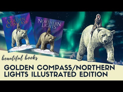
Gorgeous illustrated edition of The Golden Compass / Northern Lights | Beautiful Book Review
Hello booklovers!
Today’s episode is a close-up review of
the gorgeous illustrated anniversary edition
of the first book of Philip Pullman’s His
Dark Materials series, which is published
as Northern Lights in the UK and most other
regions, but is called The Golden Compass
in the United States.
Links to the different editions and more information
are below in the description box if you need
them.
This edition was brought out to celebrate
the book’s 25th anniversary and it is really
beautiful.
I have the British edition published by Scholastic
– as you can see here it’s a large, oversized
volume, around 11 inchers, or 30 cm tall,
with a hidden alethiometer embossed in gold
on blue boards under the dust jacket.
It’s a hybrid binding, with the page sheaves
fully stitched, but glued to the backing along
with the decorative braiding.
The book is profusely illustrated throughout
by Chris Wormell, and almost all of the images
were originally created as wood engravings
that he carved and chiselled by hand and later
coloured digitally.
As a master of this technique, he is able
to use fine gradations of tone to create a
beautiful sense of depth and dimension in
his images.
Each chapter has
that usually takes an image from the first
paragraphs, for example here we have Pan who
makes his first appearance in the book as
a moth.
You can see some of the incredibly fine detail
in the illustrations in this closeup of the
chapter title.
The illustrations are plentiful and have been
nicely added to match where they occur in
the text, and you can expect to see a half
or full-page illustration almost every couple
of pages.
Many are quite dramatic and continue across
double-page spreads which must have required
really large original engravings.
Here’s another heading featuring the Master’s
daemon as a raven.
The digital colouring over the engraved lines
combine so well in the book you can almost
see the feathers shine.
Phillip Pullman has said he was inspired to
write this story in response to John Milton’s
epic poem Paradise Lost, which tells the biblical
story of Adam and Eve being tempted by Satan
and banished from the Garden of Eden.
Pullman’s take on the story deals with “the
necessity of growing up and a refusal to lament
the loss of innocence”, albeit one that
features rather cooler daemons, armoured polar
bears and Zeppelin airships than Milton’s
original.
The American title ‘The Golden Compass’
is from a line from Milton’s poem that Pullman
originally used as the overarching title for
his whole series: “The golden compasses,
prepared / In God’s eternal store, to circumscribe
/ The universe, and all created things.”
The American publishers assumed the phrase
‘golden compasses’ referred to the alethiometer
and kept it for the book even after Pullman
advised them that the title of the book was
supposed to be Northern Lights.
Another classical work that is alluded to
across Pullman’s trilogy is William Blake’s
Songs of Innocence and Experience.
In this collection of Blake’s poems, innocence
represents the unfallen world, that we see
in childhood vitality and a lack of inhibition,
while experience is the fallen world, marked
by taking responsibility for your own decisions,
involvement in spiritual and political corruption,
and the loss of the state of innocence.
Similarly, in Lyra’s world, children whose
daemons have not yet settled are innocent
because they have been spared the adult pains
and responsibilities that come with experience,
and this is why the dust is not attracted
to them.
The aurora borealis, or northern lights
that gave the book its British title, are
beautifully represented in the illustrations.
These shifting lights are intended to represent
the thinnest part of the layers that separate
different worlds, allowing people to pass
between them, and I think that the mystical
digital colouring contrasts beautifully with
the more solidly etched lines of Lyra’s
world to manifest this idea.
Some people have also asked if there is a
difference between the American and British
editions of the book apart from the title
and regional spelling differences.
Well, there is not much of a difference in
this first book, but there is a scene in the
third book which was censored for American
audiences, presumably because American publishers
deemed it too sexual for a book they were
marketing to children.
As an adult reader you would be able to infer
what was happening there anyway so it doesn’t
change the story, but I’ll add the deleted
text in the description box below for any
American readers who are worried they might
have missed out.
All in all, it’s a beautiful edition that
I recommend for adults who love the series
or as a special gift for a younger child who
may not yet have read it.
I’m very happy to say that the publishers
have committed to producing the rest of the
books in the series in a matching format.
In fact the illustrator, Chris Wormell, has
been documenting his illustration process
for The Subtle Knife on his Instagram account,
moving between sketch and engraving, and this
is definitely worth checking out if you’re
interested – links below as usual.
Thanks for watching, and I hope to see you
again soon with some more beautiful books
for your personal library.
If you’d like to chat in the comments below,
I’d love to know what you think about this
new trend towards publishing large illustrated
gift editions – personally, I love them,
because I they add another special sensory
element to the experience of reading, and
I think these gift editions are usually more
affordable than some of the fine press illustrated
books, but they can be a little unwieldy to
read due to their size and weight.
Til next time,
Bye!